All Activity
- Today
-
Design and construction photos
Bill Cotter replied to Bill Cotter's topic in 1967, Montreal, Canada - Expo 67
A model of the Cuba pavilion. One last design photo for now - concept art of the Maine pavilion. -
Design and construction photos
Bill Cotter replied to Bill Cotter's topic in 1967, Montreal, Canada - Expo 67
Another construction view. -
Design and construction photos
Bill Cotter replied to Bill Cotter's topic in 1967, Montreal, Canada - Expo 67
A model of Man in the Community & Habitat. They sure spared no expense on the Habitat model! Pierre Dupuy, Commissioner General of Expo 67 -
Design and construction photos
Bill Cotter replied to Bill Cotter's topic in 1967, Montreal, Canada - Expo 67
The United States pavilion under construction. It looks like they had just started putting the plastic panels on. - Yesterday
-
If you're in the area visiting Mickey stop by and say hi!
-
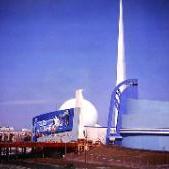
I'm scanning a batch of 8x10 photos from the design and construction phases. Here's the first one, the New York State pavilion. Being from NY I had expected more but I guess the state spent all its money on the big pavilion at the 1964-1965 World's Fair.
- Last week
-

Come celebrate the Fair's 60th anniversary this summer!
scrock30 replied to Bill Cotter's topic in Events
thank you for posting this Bill. -
I'm glad it found a new home.
-
 Thank you Bill. But sold!
 -
Very nice. If I only had the space...
- Earlier
-
Hello, BTW, I have no intention of taking $99 - it I don't get a decent offer on eBay as I expect(ed) I will end the auction. If someone in here wants it for the $100 plus shipping and fees that is great 🙂
-
I have such a chair. And I think it is worth more than $60! That seller never knew prices and used to call me for them incessantly. Ugh!
-
Come celebrate the Fair's 60th anniversary this summer!
magikbilly replied to Bill Cotter's topic in Events
All manner of events from FREE to $17 MAX! How can one go wrong? -
Email to eklongo.1969@gmail.com if interested 🙂 Thank you, Eric
-
Hi All, I have this starting on eBay for $99.99 but will gladly pull if for any member - $140 plus shipping and fees: A superb poster designed in 1938 by John Carlton Atherton to promote the New York World's Fair of 1939, held in Flushing Meadows, NY. This original lithograph displays almost surrealist elements such the burnt orange background and the floating blue earth. The work features Lady Liberty or possibly Mithrana (Mithrana was the mythical "goddess" of the Fair as seen on the Administration Building; the Statue of Liberty was the first logo design), She is holding the symbols of the 1939 World’s Fair, the Trylon and Perisphere, as well as Earth, in her lap against a rich background. The Trylon and Perisphere were designed by Wallace K. Harrison and Jacques-Andre Foulioux and were used to showcase the futuristic design that this Fair intended to express as current. The official colors of the fair were blue and orange and were clearly utilized in Atherton’s beautiful poster. This one of a series of highly sought after posters. John Carlton Atherton (1900 – 1952) was an American graphic designer, painter and illustrator. Having studied at College of the Pacific and California School of Fine Arts in San Francisco, Atherton, as a student, worked in a number of art studios where he acquired the knowledge to further his career as a professional artist. Atherton is best known for his work featured on many covers of the The Saturday Evening Post from 1942 until his death at 52. The American artist is also well known for his World War II posters, including his award-winning "Buy a Share in America" poster from 1941. This is an original vintage poster; it is not a reproduction. I guarantee the authenticity of all my posters, memorabilia, photographs, autographs and movie stills. The poster measures app. 7" x 10" and is in AS NEW Condition - Excellent with brilliant colors, no flaws or creases, no pinholes, sharp corners and untrimmed. The poster is © NYWF and printed by the Grinnell Lithograph Company NYC. Atherton's signature is under the date in white. Satisfaction guaranteed.
-
After 35 years, the "Perfect" Astronomer Photograph.
magikbilly replied to magikbilly's topic in Capturing the Rainbow
Thank you Jim. I like that quote. It makes me want to post one of my favorite stills signed by one of my favorite directors. -
https://www.6sqft.com/queens-theatre-60th-anniversary-1964-new-york-worlds-fair/
-

After 35 years, the "Perfect" Astronomer Photograph.
Jim replied to magikbilly's topic in Capturing the Rainbow
“Life is in color, but black and white is more realistic.” -Samuel Fuller, film director Eric, the first shot is wonderful simply because it certainly appears to be that of an amateur, someone impressed by that mysterious sculpture over eighty years ago. The second photo is so ethereal, so haunting. The contrasts of dark and light, the shadows, the almost invisible Trylon and the glowing Astronomer and Perisphere all combine for a stunning photographic capture of the power the Great Fair had over the imagination of millions of visitors so eagerly drawn to the promise of a glorious tomorrow. Thank you for posting these photos. They are wonderful. -Jim -
After 35 years, the "Perfect" Astronomer Photograph.
magikbilly replied to magikbilly's topic in Capturing the Rainbow
Thank you for the careful thoughts and observations Wayne! I agree - I am hoping some sort of auto something or other was used to scan the daytime image. It is not my scan. I did make the night scan. I have a new not to super scanner and when it is hooked up I will have a go. It will be delivered today! It may be here now... What I am unable to really do is visualize the night photograph in color... -
After 35 years, the "Perfect" Astronomer Photograph.
waynebretl replied to magikbilly's topic in Capturing the Rainbow
Eric, to me it's apples and oranges. Both have notable aspects. My critique: Daytime shot: very flat lighting, too bad the sun wasn't more distinct - but the extreme angle says it all about the overwhelming monumentality. Night shot: interpretation and reaction will be heavily influenced by the viewer's knowledge of the fair - the heavy shadowing gives an impression today of an A.I. generated image with "dark, moody" as a prompt. The shadow on the perisphere is especially surreal looking. Thanks for sharing! -
After 35 years, the "Perfect" Astronomer Photograph.
magikbilly replied to magikbilly's topic in Capturing the Rainbow
Thank you Bill. Before this, my other contender was this. As a night image it may hold its ground with the above 5x7? This has an ethereal quality lacking in the daytime image. Who prefers which? -
After 35 years, the "Perfect" Astronomer Photograph.
Bill Cotter replied to magikbilly's topic in Capturing the Rainbow
Very nice -
Hi All, I hope you like it 🙂 Better than anything I have or have had. From the clues visible, this is indeed 1939;
-
Hi Bill, I have now seen them from just "anywhere" USA, the 1934 World's Fair...mine is unsigned - they are usually signed. Without an engraving I can not be certain so - not on display.
-
Interesting. Were they sold with personalized engraving/etching? A neat find.